|
|
|


Search results
-

Toronto Eaton Centre (Ongoing Renewal) | ?m | ?s | Cadillac Fairview | Zeidler
...my increasingly rotund stature may cause me to get stuck down that pipe somewhere though. >.<- UtakataNoAnnex
- Post #3,883
- Forum: Buildings
-
Toronto Valhalla Village | 122.09m | 37s | KingSett Capital | BDP Quadrangle
Soooo...being KingSett and all, does @ProjectEnd-san still think this one is a zoning exercise? 😼- UtakataNoAnnex
- Post #225
- Forum: Buildings
-
Toronto Ontario Line: Queen-Spadina Station | ?m | 1s | Metrolinx | HDR
Building subways is expensive though...where complex excavation, structural soundness, logistics, materiality and liability all have to be considered. Particularly where deep tubing under our city's oldest areas and crossing where a subway system already exists. So making it all fanciful for the...- UtakataNoAnnex
- Post #166
- Forum: Buildings
-
Toronto Portland Commons | 71.7m | 15s | Carttera | Sweeny &Co
Potential retail here: Nothing Burgers, The White Elephant & Arms, Vapour Wares, The Incorporeal Dragon, Ghost City... >.<- UtakataNoAnnex
- Post #679
- Forum: Buildings
-
Toronto Lower Don Lands Redevelopment | ?m | ?s | Waterfront Toronto
...yeah, it would be so much easier to write the letter "S" like this: "/" 😼- UtakataNoAnnex
- Post #6,827
- Forum: Buildings
-
Toronto The One | 328.4m | 91s | Mizrahi Developments | Foster + Partners
Nobody is saying anything bad about the building though.- UtakataNoAnnex
- Post #17,631
- Forum: Buildings
-
Toronto Ontario Line: Queen Station | ?m | ?s | Metrolinx | HDR
...you're the only one that's ever tagged those bathroom tiles on 401 Bay, Mr. kotsy. <3- UtakataNoAnnex
- Post #43
- Forum: Buildings
-
Toronto Lower Don Lands Redevelopment | ?m | ?s | Waterfront Toronto
It's smexy when it's curvy... <3- UtakataNoAnnex
- Post #6,823
- Forum: Buildings
-
Toronto West Don Lands: Block 13 | 139.31m | 43s | Dream | Henriquez Partners
It's not complimentary when it will standout like a sore thumb. Conversely, there is nothing wrong with contrasting if done in good taste. Ultimately, it should be both interesting and inviting even with a simplified design. Dream, et al, have failed in all 3 counts here, IMO.- UtakataNoAnnex
- Post #89
- Forum: Buildings
-
Toronto 49 Jackes | 70.35m | 19s | Lifetime | Turner Fleischer
Apart from being made even more bland and soulless, is there a reason why it was stumpified?- UtakataNoAnnex
- Post #31
- Forum: Buildings
-
Toronto Pinnacle One Yonge | 345.5m | 105s | Pinnacle | Hariri Pontarini
Or Portugal decided to claim this tower for their own without Pinnacle or the Feds knowing about it... 😼- UtakataNoAnnex
- Post #6,773
- Forum: Buildings
-
Toronto Quayside: Timber House | 49.2m | 12s | Dream | David Adjaye
/ugh- UtakataNoAnnex
- Post #27
- Forum: Buildings
-
Toronto The One | 328.4m | 91s | Mizrahi Developments | Foster + Partners
/sigh- UtakataNoAnnex
- Post #17,608
- Forum: Buildings
-
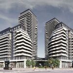
Vaughan RioCan Colossus Centre Redevelopment | ?m | 55s | RioCan | Hariri Pontarini
I don't think PE or I are making the dodgy claims here. But sure, gaslight away...- UtakataNoAnnex
- Post #77
- Forum: Buildings
-
Toronto KING Toronto | 57.6m | 16s | Westbank | Bjarke Ingels Group
...least they have cladding. 😼- UtakataNoAnnex
- Post #1,867
- Forum: Buildings
-
Vaughan RioCan Colossus Centre Redevelopment | ?m | 55s | RioCan | Hariri Pontarini
So unless this is unique to this proposal, I'm not sure what the point is here...as it is happening all over in the claim.- UtakataNoAnnex
- Post #75
- Forum: Buildings
-
Toronto Quayside: Timber House | 49.2m | 12s | Dream | David Adjaye
Why?- UtakataNoAnnex
- Post #23
- Forum: Buildings
-
Toronto Pinnacle One Yonge | 345.5m | 105s | Pinnacle | Hariri Pontarini
I wonder how they're going work that glass around those floor plate protrusions... "I think they're turning those into balconies, Uta..." ...oh! 🙀- UtakataNoAnnex
- Post #6,763
- Forum: Buildings
-
Toronto The Diamond | 101.14m | 36s | Neudorfer | Gabriel Bodor
...which ends up being its only saving grace in a weird kinda way.- UtakataNoAnnex
- Post #328
- Forum: Buildings
-
Toronto West Don Lands: Block 13 | 139.31m | 43s | Dream | Henriquez Partners
I get that. But at the end of the day if someone is making that sorry arsed excuse here, they need to hang their head in shame.- UtakataNoAnnex
- Post #83
- Forum: Buildings