There's something wrong with this rendering:
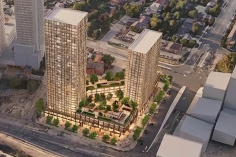
The proposal is shown simply too short compared to the existing and other proposed buildings around it. If its north-south-east-west coords are all correct though, how do you end up with something that's looking about a third shorter than it should? Rendering experts weigh in maybe? There's no way there'll be a "You must be shorter than this line to ride/live here" sign on this building IRL, so how have they botched this so badly in Renderland?
42
42
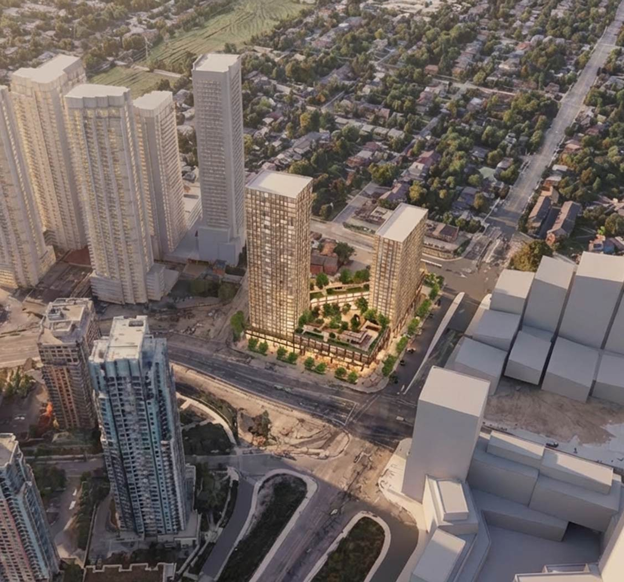