Toronto 66 Wellesley East | 120.79m | 36s | MOD / Montez | DSAI

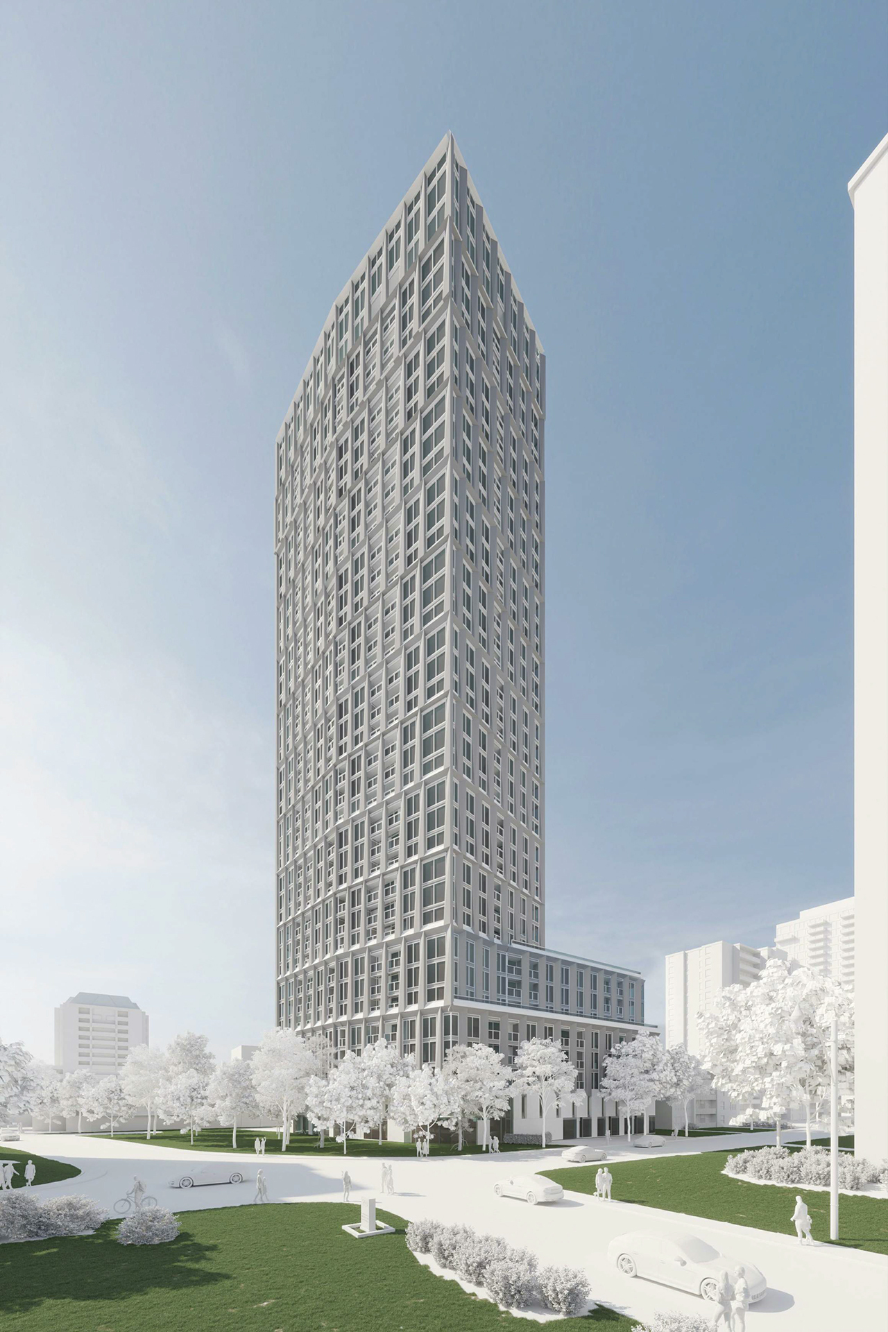
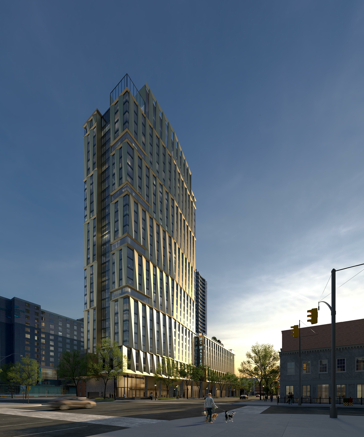
The new design feels more elegant, refined and timeless than the previous one. Love the manually-laid brick work on the podium and the arches. Very solid street presence and feels stablished like it’s always been there. Wishing for the retail to be community oriented with independent shops that add to the neighborhood’s character, not just lsrge corporate retailers
 
Ok....lets see what I can add here.

@Paclo

First, a higher quality render at-grade:

1772403430108.png


Then will move on to some docs:

Revised Site Plan:

1772403631329.png


Ground Floor Plan:

1772403578623.png


Typical Floor in Tower:

1772403700145.png


Typical Suite sizes vary, some are a bit small, but overall much better than what we have been seeing, most 1 beds are in/around the 600ft2 mark, 2 beds varying from ~650 to just shy of 800ft2.
The 3 bdrm is well over 1,200ft2.

Elevator Ration: 431 suites to 4 elevators is 1 elevator per 108 units.

Stats:

1772403872569.png

1772403897802.png


Description:

1772403939558.png

1772403980551.png

1772404016615.png
 
This looks eminently do-able, and is a relief after all the tortured forms of the previous proposals. It's nice to see the tower has some texture, and the fact that they're saying the red-brick base will be hand-laid is wonderful. It looks like a really positive addition to the street.
 
This is miles better than the last iteration. I love the ground level brick work, it feels very respectful of the neighbourhood. And I'm happy anytime a tower isn't plonked right on the corner.
Totally agree. I’m just confused as to why this is a trend in Toronto where Buildings have beautiful brick bases and then the rest of the building be sterile white facades😭. Can they not continue the brick throughout the rest of the building???
 
Totally agree. I’m just confused as to why this is a trend in Toronto where Buildings have beautiful brick bases and then the rest of the building be sterile white facades😭. Can they not continue the brick throughout the rest of the building???
It's likely because the tower is overtop the buff heritage building and less so the red brick building. So the colour is intended to match that as opposed to the part of the podium that it's not really part of 'visually'.
 
It's likely because the tower is overtop the buff heritage building and less so the red brick building. So the colour is intended to match that as opposed to the part of the podium that it's not really part of 'visually'.

Ok, that doesn’t explain why it has to be boxy and colourless though. Why is white black and grey the default palette for contemporary buildings???

Personally, I think there are WAY bigger targets for criticism than this building — the base looks good and the tower looks OK — but the fact that the tower might be considered well-designed (it’s literally a white brick, not much to it) shows how far our society has fallen in terms of architectural expression, in my opinion.

There is something to be said about this being the default architectural expression of our times; I would call it austere referentialism. This type of construction is common in Toronto developments of the last 15 years, where the podium makes reference to the historic character of the neighbourhood and city (i.e. facadism, heavy use of brick, etc), but dramatically shifts to an austere utilitarianism for the tower itself.

One could argue it may stem from the cultural shift towards having our faces buried downwards at our devices. People aren't looking upwards in awe of the city like they used to, so why bother creating a visually compelling (and more expensive) design?
 
Ok, that doesn’t explain why it has to be boxy and colourless though. Why is white black and grey the default palette for contemporary buildings???

Personally, I think there are WAY bigger targets for criticism than this building — the base looks good and the tower looks OK — but the fact that the tower might be considered well-designed (it’s literally a white brick, not much to it) shows how far our society has fallen in terms of architectural expression, in my opinion.
It's not white brick. I'd also like to think this is a placeholder of sorts while MOD and DSAI sort out the expression. Diamond has used this previously at 185 Balloil and Macmaster Graduate Residence (among others):


It's not white brick. I'd also like to think this is a placeholder of sorts while MOD and DSAI sort out the expression. Diamond has used this previously at 185 Balloil and Macmaster Graduate Residence (among others):


Poor choice of words. The shape of the building is brick-like.
 

Back
Top