|
|
|


Recent content by Chronamut
-

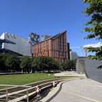
Hamilton 75 James Condos | 108m | 34s | LIUNA | Graziani + Corazza
I have to admit though, for the back of the building on the right? It's FASCINATING to see a perfectly intact one - with all the windows and doors - none of them boarded or bricked up. The building is in REALLY good condition. -
Hamilton 325 James Street North | 45.7m | 12s | Core Urban Inc. | Lintack
Not a big fan of the "whited" brick.. makes it feel.. "unclean".. -
Hamilton 75 James Condos | 108m | 34s | LIUNA | Graziani + Corazza
They really need to put something up where the hotel used to be and hide that awkward wall area. -
Hamilton The Point | 19.25m | 6s | Yoke Group | Lintack
Lawdy! *fans self* But let's not jump the boat - it's still in its pajamas - it has PLENTY of time to disappoint still :P -
Hamilton The Point | 19.25m | 6s | Yoke Group | Lintack
I would actually have to agree. -
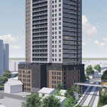
Hamilton Television City | 110.14m | 32s | Lamb Dev Corp | a—A
Ah yes so brutalist era concrete panels do lol.. -
Hamilton 354 King Street West | 82.71m | 26s | Vrancor Development | NEUF
Welcome to blandsville lol - plenty more grey white and black ones to come in this area. -
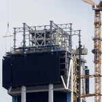
Hamilton Television City | 110.14m | 32s | Lamb Dev Corp | a—A
They're not even really looking like THIS render.. or THIS one.. At least they warned us about that on the last image, but it seems it's gotten crappier and crappier as cost and engineering realities hit hard. Looking pretty "Vranich"ey now, the podium.. -
Hamilton Television City | 110.14m | 32s | Lamb Dev Corp | a—A
Those giant first floor panels are looking nothing like the render.. -
Hamilton Tiffany Square Condominiums at West Harbour | ?m | 8s | Sonorak
It's amazng how many projects in hamilton have been stalled or destroyed due to contaminated soil issues.. -
Hamilton The Design District 41 | ?m | 31s | Emblem Developments | Arcadis
Can't wait to see the third tower start to go up! -
Hamilton 152 King Street West | 41m | 12s | Vrancor + Equal Parts
The original design's italianate proportions have long since been butchered, at this point there is very little of the original character left, with the windows essentially being all that is left. Let us just be happy SOMETHING is being done with it. -
Hamilton Coppley Building Redevelopment | ?m | 4s | Core Urban Inc. | Lintack Architects
Wait what is going on with that bottom window on the right? Did they seal up a window?? Why?? Looks weeeeird.. -
Hamilton 152 King Street West | 41m | 12s | Vrancor + Equal Parts
Yeah that is what I was thinking. My thinking is they will remove the windows and pediments, due to the william-thomas-esque clause that you have to retain the exterior facade for heritage buildings (although I am unsure if this is classified as "heritage"), demolish the building, rebuild the 3... -
Hamilton 152 King Street West | 41m | 12s | Vrancor + Equal Parts
If I had to guess they will rebrick it - whether that means taking the windows down or just redoing the brick I am not sure - but I have more of a feeling its the latter because old buildings are protected from building code as long as you don't threaten the structural integrity of them, so...