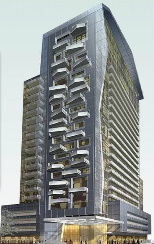
The thick glass on the side of the buiding with it's uneven edges is very unique... and the windows are actually indented... not flush. There is also other, smaller, accents like the canopy above the front entrance... It will be a nice building if it can stay true to the rendering
I have to say, those balconies look like absolute crap. It looks like G+C tried to summon Liebeskind and failed miserably. It resembles a stick of rock candy that you'd get from the ROM or Science Centre gift shop (not in a good way), or a cheesy indoor rock climbing wall. If they toned down the balconies and kept the angular glass frame wall, it would be a perfectly fine little modernist box, but I'd still be concerned about that square tile cladding which could easily make it look right at home in a low-rise business park in Mississauga.
I love the (way more) edgy designs of some of the proposals in the Entertainment District, but this is really cheesy.
Grey, it doesn't appear reminiscent to me of Libeskind at all. You really think G+C are trying to do Libeskind just because of angled balconies? It looks to me more like they are taking Clewes most recent angled balcony designs and making them jarring instead of undulating. A giant pushing up against the west wall of this building would get his eye poked out.
42
")