You are using an out of date browser. It may not display this or other websites correctly.
You should upgrade or use an alternative browser.
You should upgrade or use an alternative browser.
Toronto Casa II Condos | 184.09m | 56s | Cresford | a—A
- Thread starter urbandreamer
- Start date
Miscreant
Senior Member
Member Bio
- Joined
- Oct 9, 2011
- Messages
- 3,616
- Reaction score
- 1,795
- Location
- Where it's urban. And dense.
I think this is just really, really sharp. Extremely fine lines. I like it a lot.
Benito
Senior Member
modernizt
Senior Member
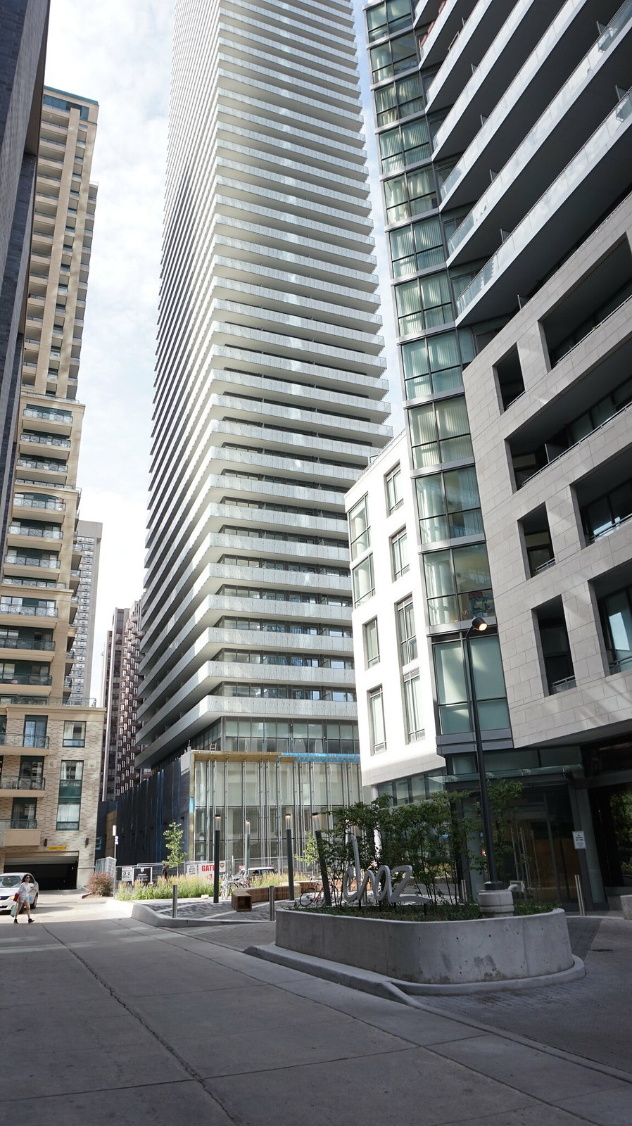
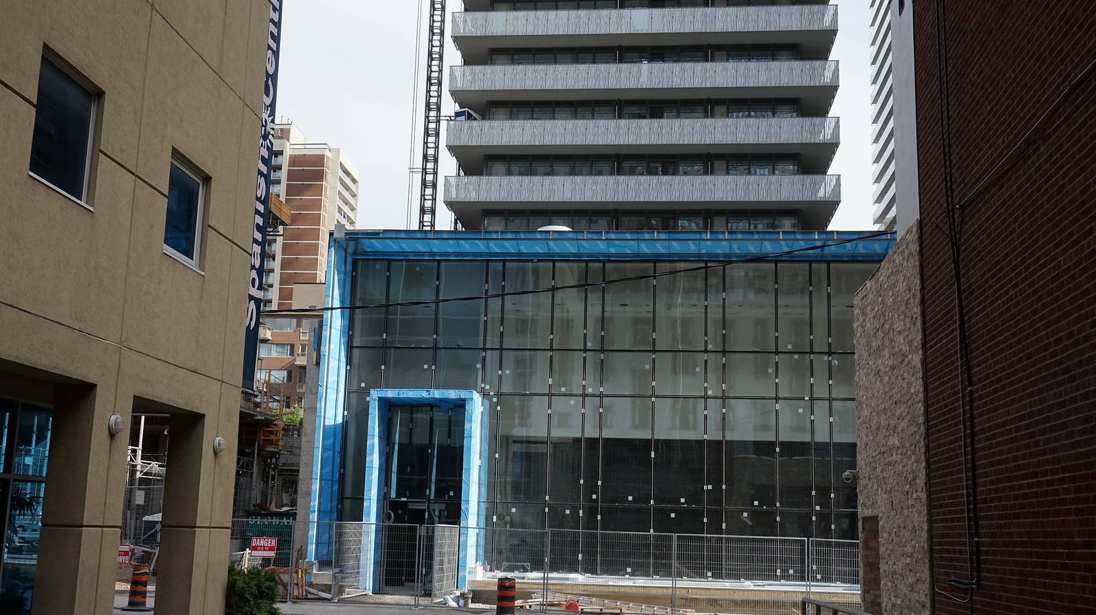
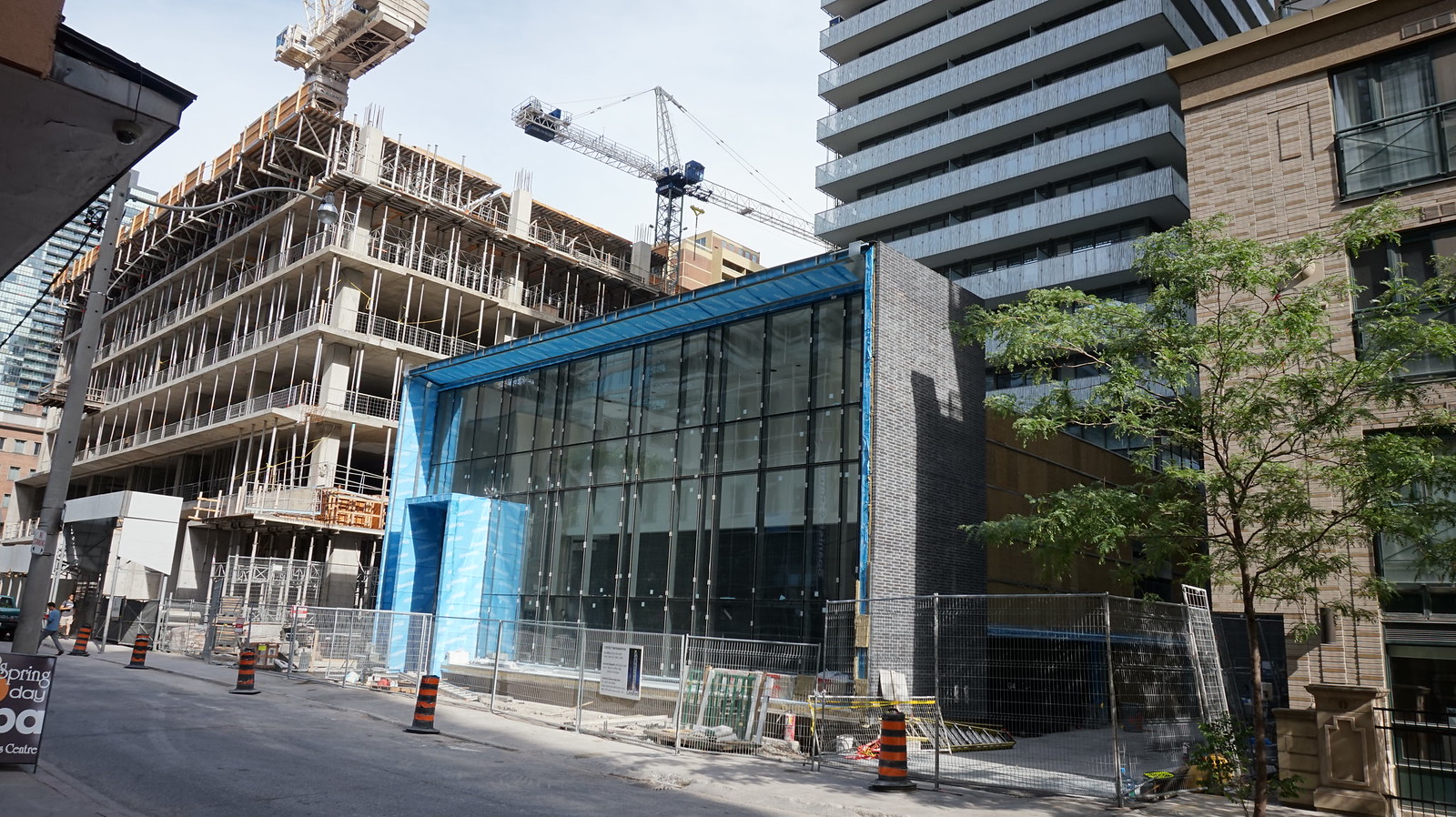
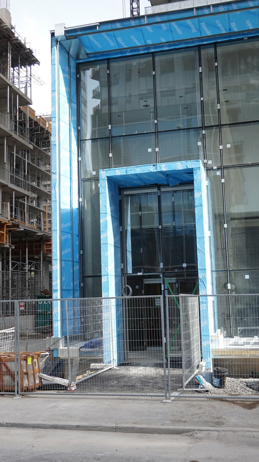
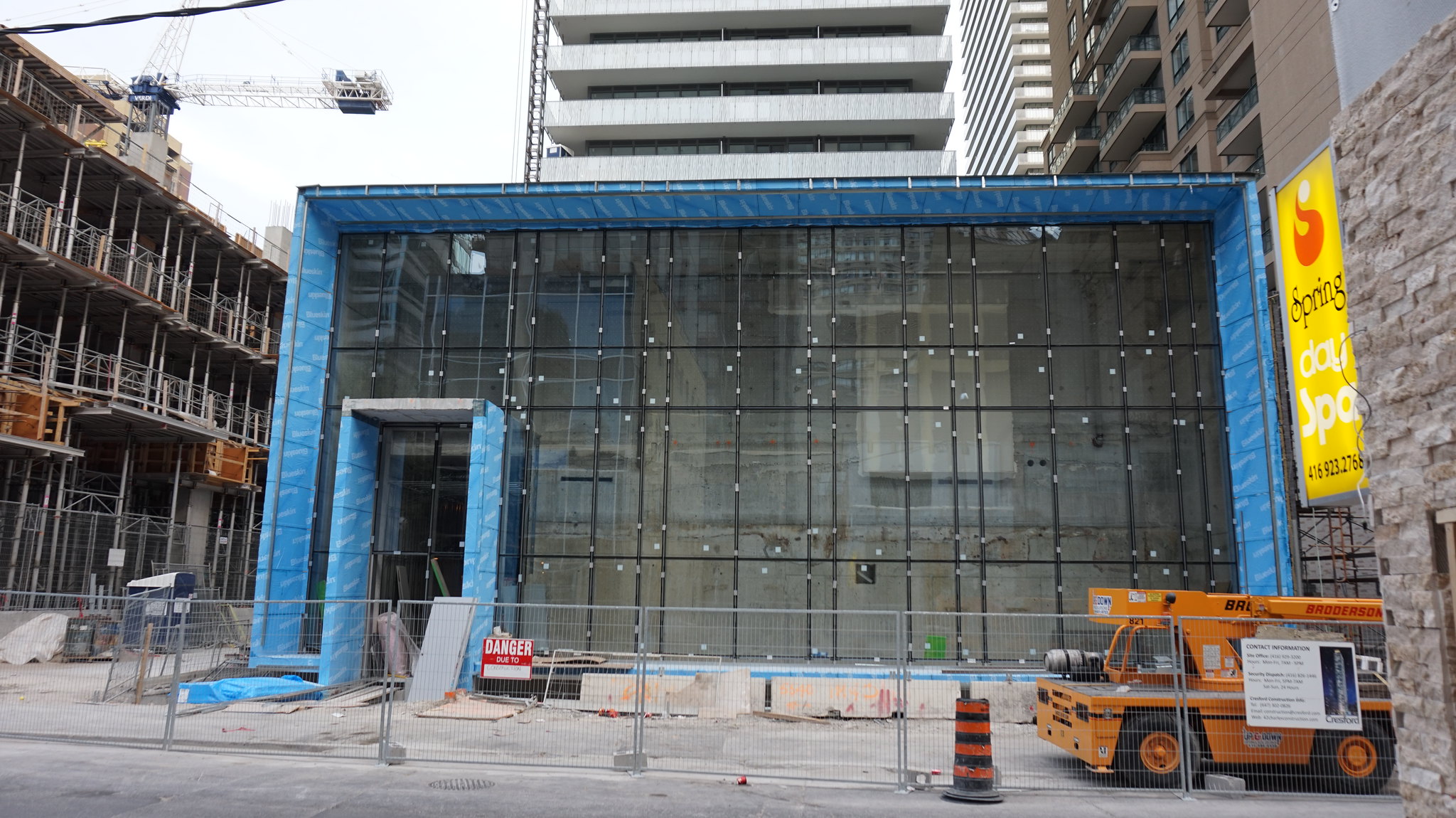
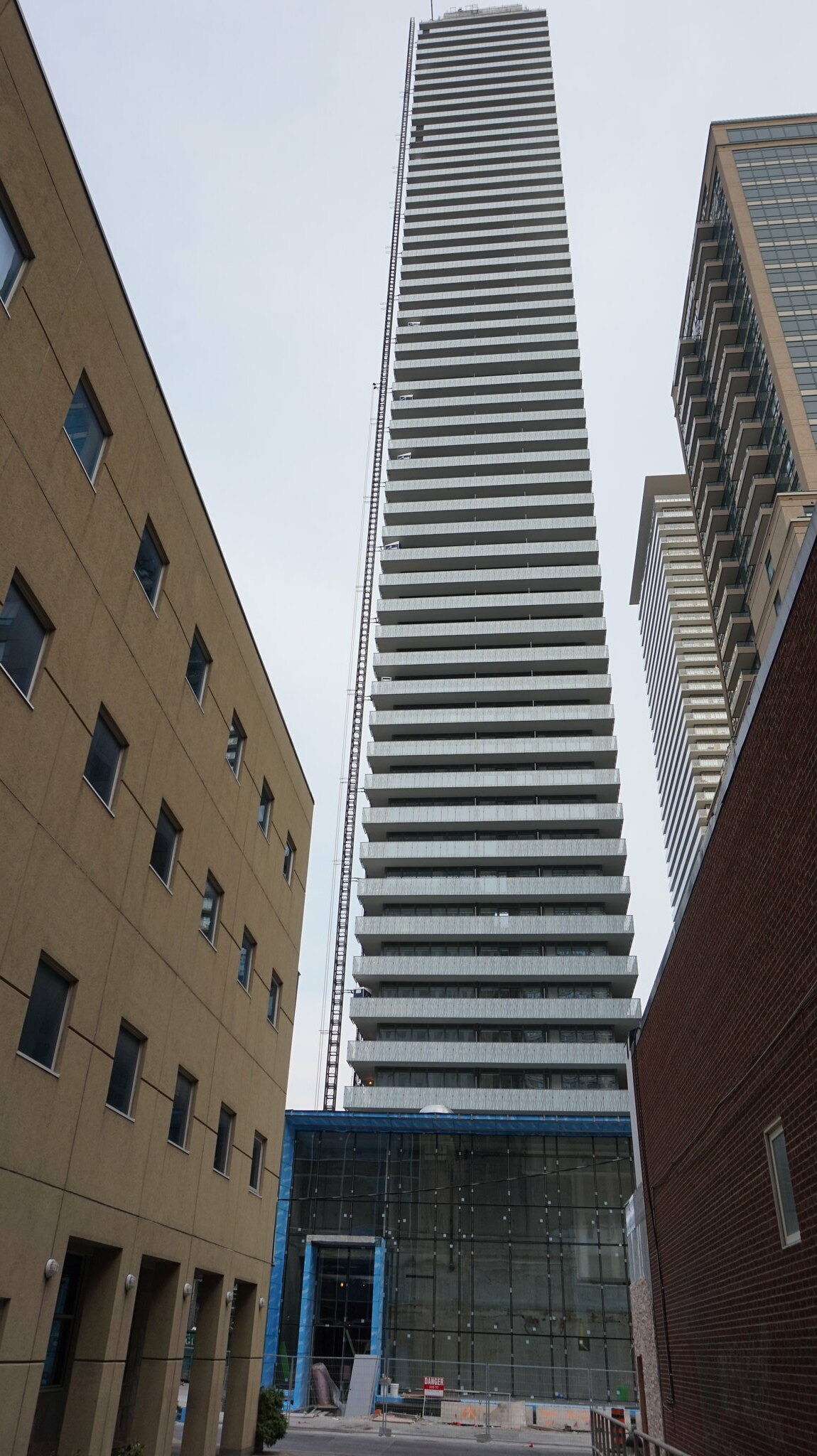
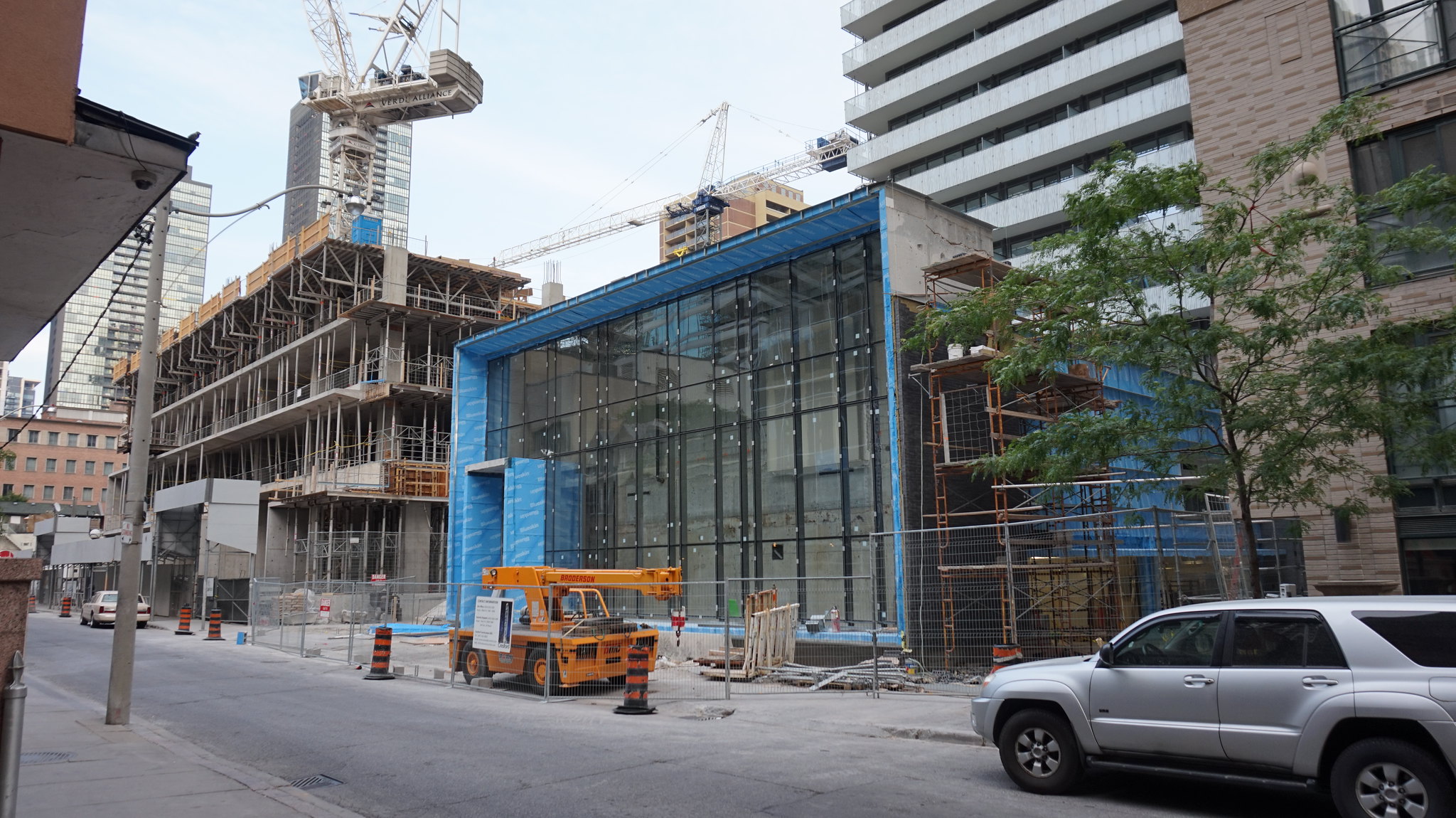
The Charles Street side should have that taller entrance extrusion found on the Hayden St. elevation; it's more stately and signifies the building's main entrance in a stronger way.
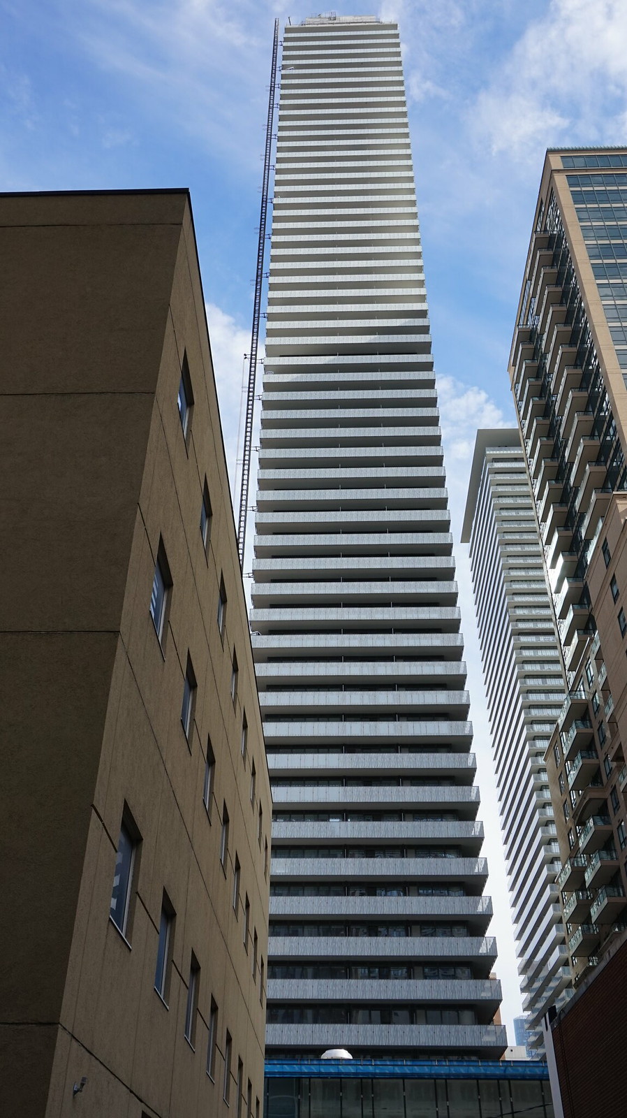
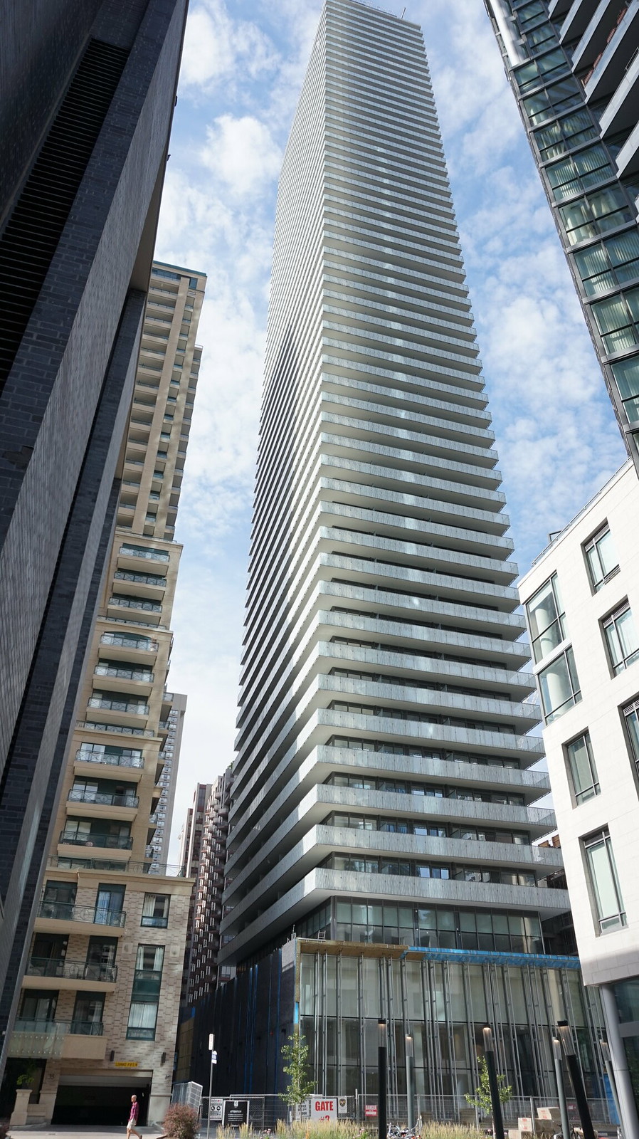
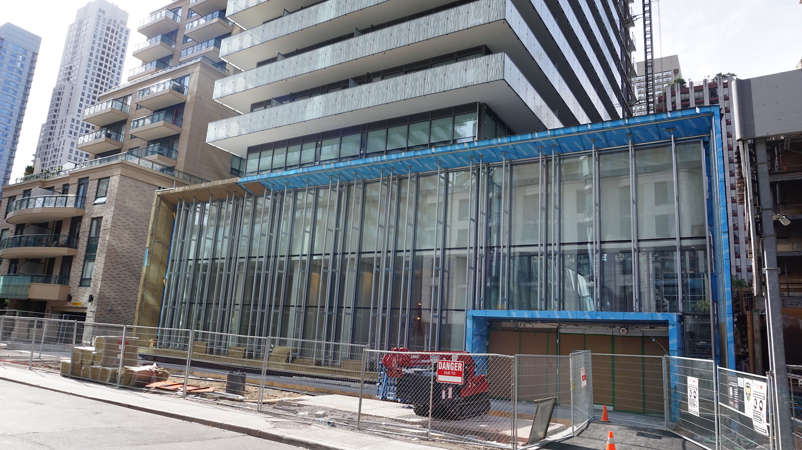
It seems as though we have lost the vertical fins that the podium was going to have. Those mullions in the same pattern just don't have the same effect. When I look at this project and compare it to CASA (I), other than the fritted glass which is likely a higher cost, I see a design that has many austerity measures applied to its earlier iterations in order to create an even higher profit margin. It's a shame. It's as if Cresford got greedy after CASA and decided to really pull things back on the next phase. I was hoping for something even more elegant than the original CASA, but the podium, the tower, the materials, and the detailing -- they all strike me as compromised when compared to the original.
I say that as someone who appreciates the work aA has done here but also sees how the designers were limited by their client.
Benito
Senior Member
Marcanadian
Moderator
Benito
Senior Member
ProjectEnd
Superstar
Benito
Senior Member
Nice, it will reflect the pattern on the balcony glass.
Solaris
Senior Member
Looks like Cresford generally maintained the original rooftop feature design here (warm golden glow would have been nice):

http://urbantoronto.ca/database/projects/casa-ii-condos

http://urbantoronto.ca/database/projects/casa-ii-condos
modernizt
Senior Member
Fins are still going on the podium after all; the structure for the fins are going on now.
PMT
Senior Member
TheKingEast
Senior Member
Last edited:


 Toronto


