You are using an out of date browser. It may not display this or other websites correctly.
You should upgrade or use an alternative browser.
You should upgrade or use an alternative browser.
Toronto 455 Dovercourt | ?m | 5s | Curated Properties | RAW Design
- Thread starter AlbertC
- Start date
adHominem
Senior Member
Well, that's interesting-looking.
Looks like the existing Child Services Centre isn't long for this world, then.
Looks like the existing Child Services Centre isn't long for this world, then.
At RAW they have nicknamed this The Hovercraft.
42
42
innsertnamehere
Superstar
This looks like it will be built on top of the existing building, maintaining seperate uses. Notice the exterior elevator shaft as well as the addtional entry leading directly to it. I have a feeling this development will pay for renovations of the child services centre.
TheKingEast
Senior Member
Love little projects like this. Looks good.
greenleaf
Senior Member
Part of me wishes they would use concrete instead of those bronze rectangle panels to create a sort of neo-brutalist look. Anyway, this looks weird and awesome.
UrbanFervour
Active Member
Am I the only one who thinks RAW has missed the mark on this one? The massing of the existing building is nice. Why push it in a way that feels awkward and top-heavy? I know awkward massing is RAW's 'thing' but sometimes the logical, elegant solution IS actually best.
TrickyRicky
Senior Member
I kind of admire the audacity of the concept. I worry though that this could turn out to be one of the city's ugliest structures.
bilked
Senior Member
Website says this one is sold out. Construction imminent?
urbandreamer
recession proof
ProjectEnd
Superstar
urbandreamer
recession proof
Looks like there ought to be a 40 storey tower overhead


agoraflaneur
Active Member
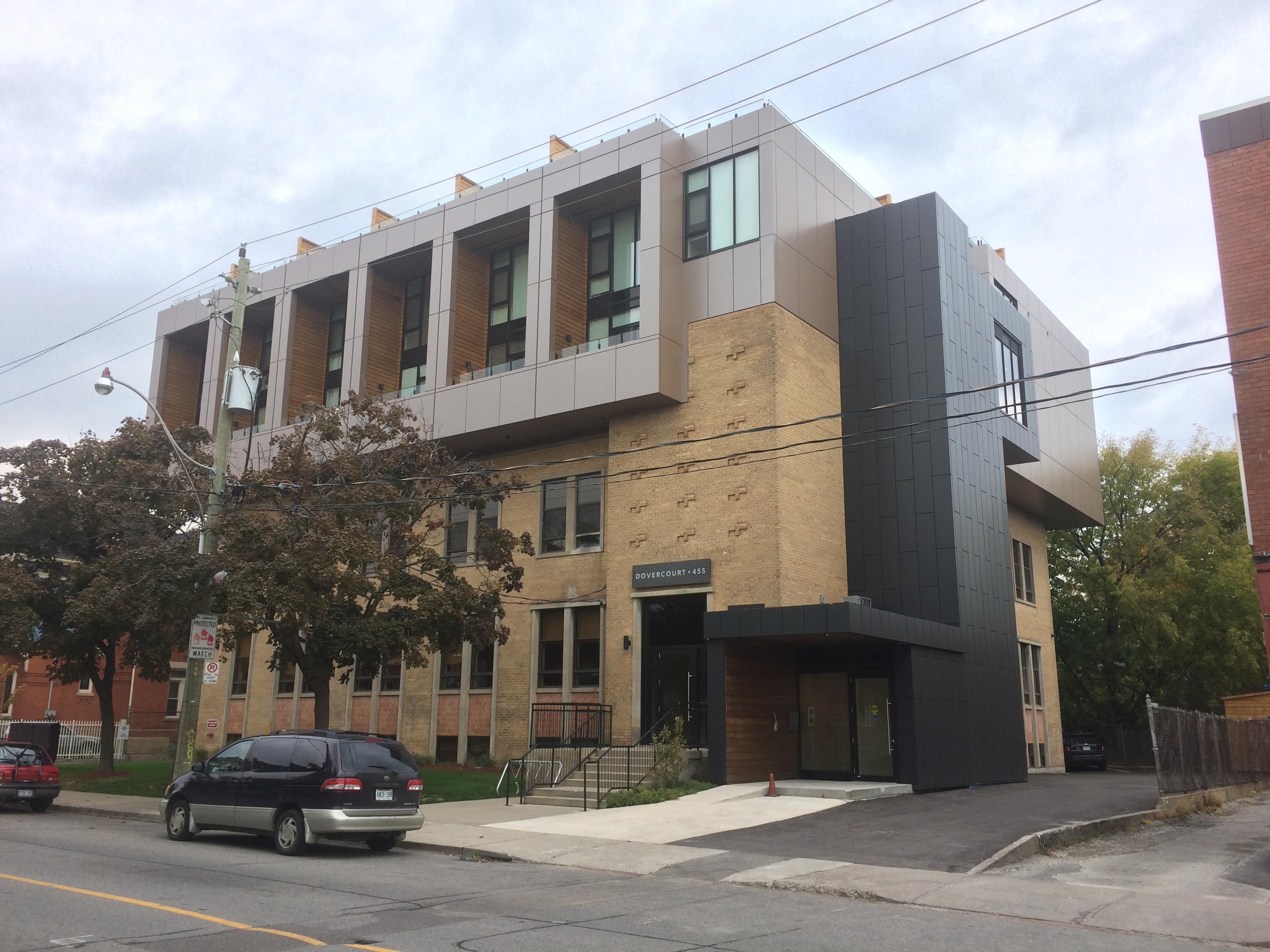
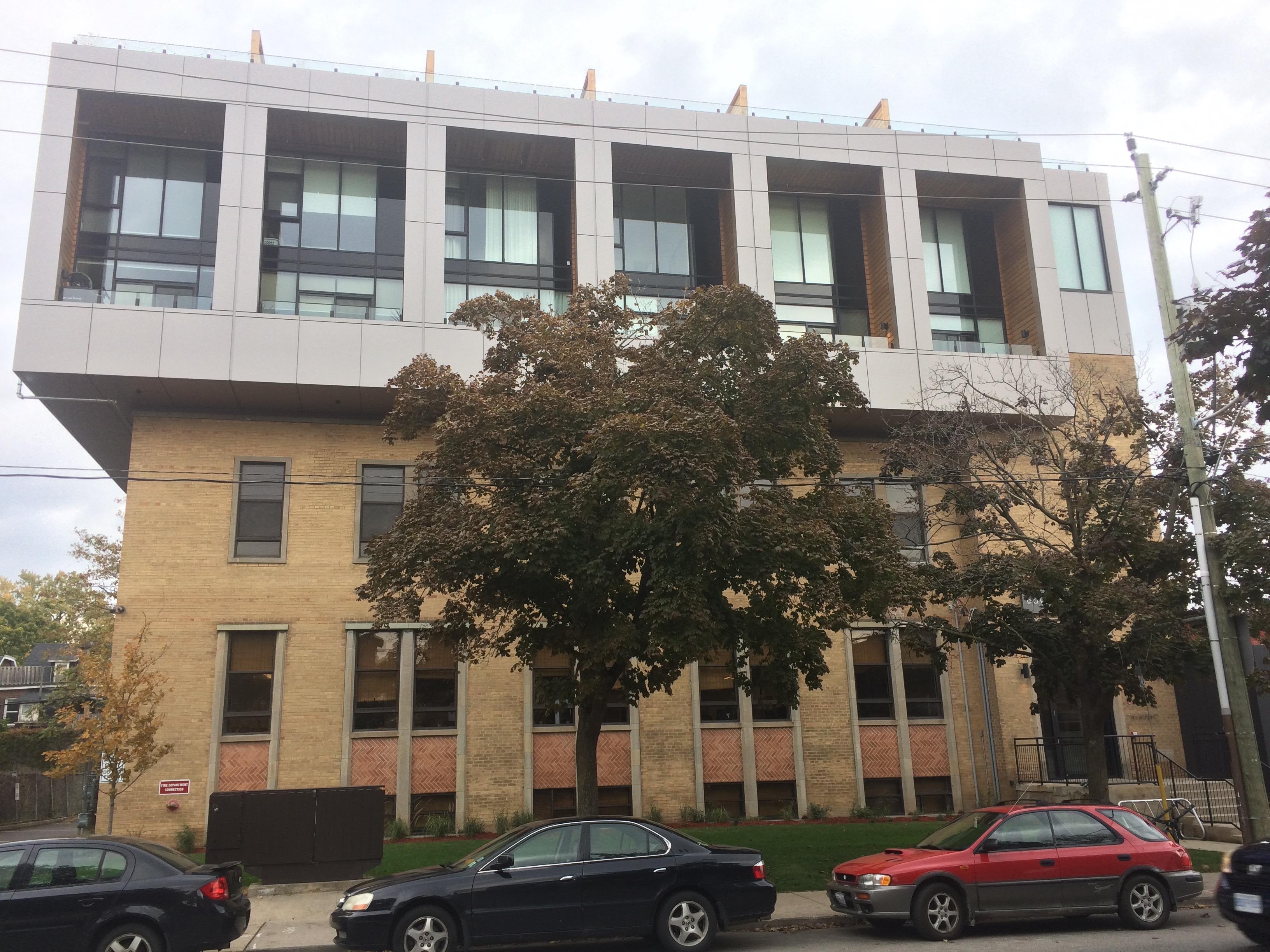
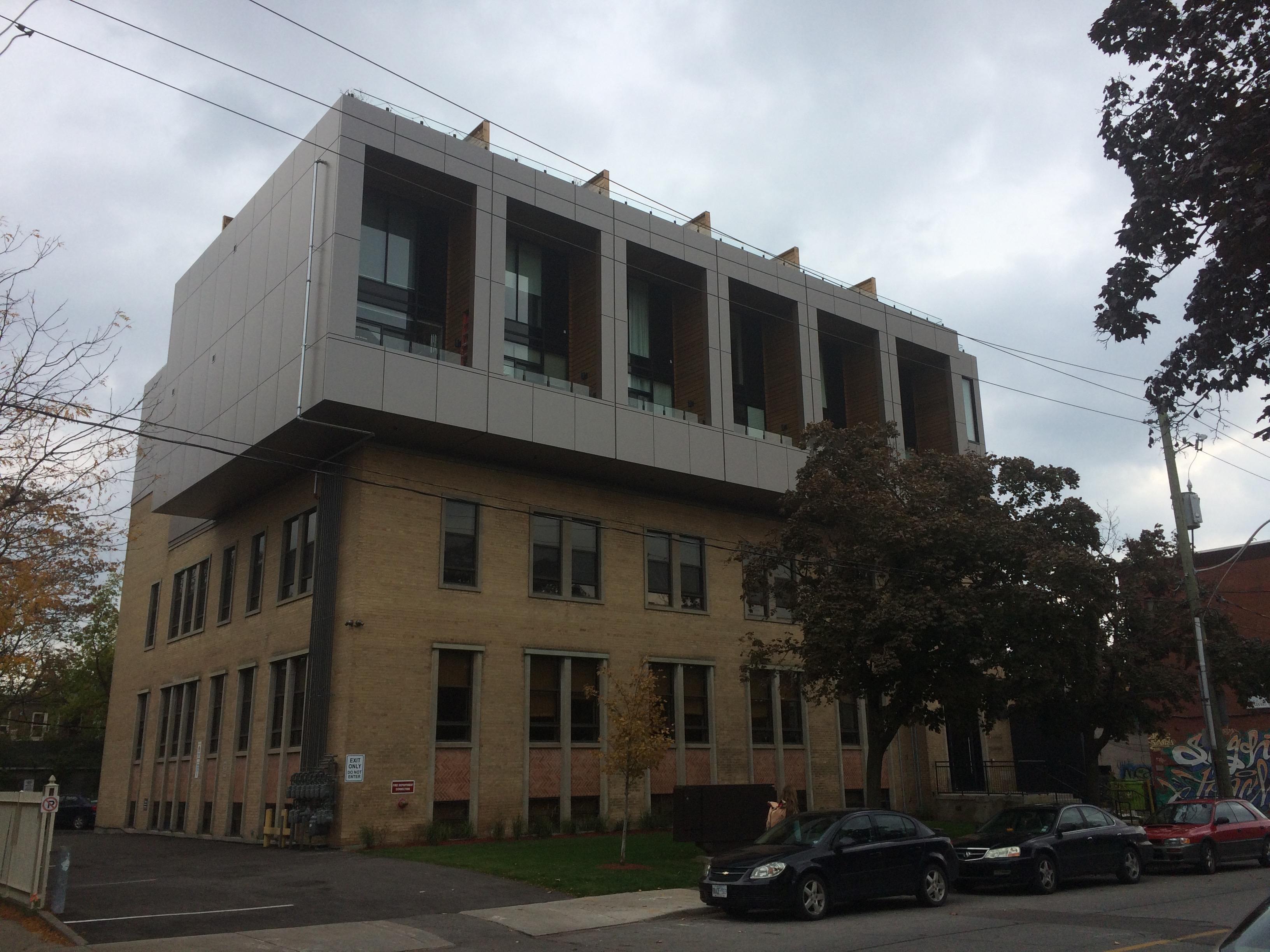
From last week. This turned out quite nicely.


AlbertC
Superstar
Yeah, I walk by this building often on my way to the Y. Good adaptive reuse here.


