News   Apr 19, 2024
 2.8K     1 
News   Apr 19, 2024
 1K     3 
News   Apr 19, 2024
 1.6K     3 

Transit Fantasy Maps

That map looks great MisterF :).

Simplistic, not too fussy. I always thought DRL could/should be a commuter rail line instead of a subway and along with the Queen Line most of the underserviced areas of downtown would be accessed. I hope the Eglinton tunnel has spacing like that too.
 
which would make geographic accuracy even more important by your logic no? Being on the Northern Line at Camden Town Station means very little.

in toronto, if you're on, let's say the Finch West LRT, and you're at Jane Station, you can place yourself. You know yo9u're at Finch and Jane. So geographic accuracy isn't 100% imperative on this map at all.

MisterF, despite pulling together a great geographic/scaled map, shows what I am talking about... the lines are so dense in the core that to provide further detail would be impossible... and looking at the GO Lines out towards the fringes of the GTA, the lines are increidbly sparse and take up valuable space on a composition. Not saying that it isn't a good map, but my map has a totally different purpose.
 
^ Yeah, the whole point of a schematic map to is to simplify lines and make them straighter. Yet on 299's map, the Jane LRT, a relatively simple and straight north-south route, has become a complex and curvy east-west line.

Not that the map is necessarily bad just because of that, but it just shows how difficult it is to make a schematic map (and why it may not even be suitable for all situations anyways), which is partly why I opted for scale instead for mine.

EDIT: Ooops I pressed the some button on my keyboard and it posted my unfinished post. I was responding to ScarberianKhatru.
 
No, geographic accuracy is less important in London because it has no street grid...however, an 'orthogonal' transit map is absolutely critical in Toronto because of our straight concessions. Stylizing straight transit lines will only cause confusion and undermine our mental maps of the city. I would assume London's mental maps are a collection of neighbourhoods situated largely based on the Underground maps.

The current TTC subway map is straight and 'accurate' but it is vertically squished...if more lines were added, it would get difficult to keep everything straight without reducing font size and smushing stations together to keep the scale right. However, they would do everything possible to avoid curving straight routes like Jane or Eglinton.
 
Not to start a subway vs. Transit City debate, but this is probably what would be built for the same cost if we went exclusively subway, assuming that the Danforth extension would be $2-billion, the Sheppard extension being $2-billion, and Eglinton West being $2-billion. Highballing the costs a bit, so feel free to imaginatively extend each line by a station or two.


RMsubway.pdf (425KB) (even the file is larger for some reason!! ;))


for comparison
TorontoRMalt2.png


It looks so much better with the Sheppard line and Danforth lines converging at Scarborough Centre!

And thanks for taking my advice and making the TC lines look different from the subway...since they are very different. I would take the equivalent in subway extensions any day, even if they are in Scarborough. Scarborough deserves them.
 
MisterF, despite pulling together a great geographic/scaled map, shows what I am talking about... the lines are so dense in the core that to provide further detail would be impossible... and looking at the GO Lines out towards the fringes of the GTA, the lines are increidbly sparse and take up valuable space on a composition. Not saying that it isn't a good map, but my map has a totally different purpose.
Yeah it does look cluttered in the core, which is why I saved it as a pdf for easier viewing. I actually like geographic maps better than schematic maps, even for complicated systems. The Tokyo transit map is a jumbled mess I can hardly make heads or tails of, but I saw a scale map of the system once and I actually found it easier to follow. I'm probably in the minority on that though.
 
I just noticed that map includes Hamilton - James as a GO Station. Hope that becomes a reality.
 
Well here is my map. I don't know enough about Parkdale, East York, Scarborough, Etobicoke, or Mississauga to be able to select the specific location of the new subway lines out there, but I drew something in where I think that a subway might make sense.

Some important notes about the map:

1) The RT is converted to subway, and removed from the railway alignment.
2) Wider sections of the Yonge and Eglinton lines indicate express tracks.
3) West of the 427, every other Eglinton train will serve either the airport, or Mississauga.
4) The Don Mills line runs along Dundas with a station at Church, then heads southwest to run along Queen westward from Bay. That way all of Scarborough and Etobicoke can access Ryerson and the CBD without using the YUS line.

ttc.jpg
 
299, great work. I'd love to know what programs or methods you are using to generate these maps!! You've really answered to one of my peeves is that some of the maps out there (especially GO's :eek:) look like excrement. Your motif is similar, I feel to Tokyo's system map. Great work, it looks beautiful. Roads should be perfectly represented in scale and direction, but transit lines are dependent on station locations and I believe there should be some artistic creativity in the placement of the lines to give better representation of their use, etc. You seem to be doing that, which is awesome.

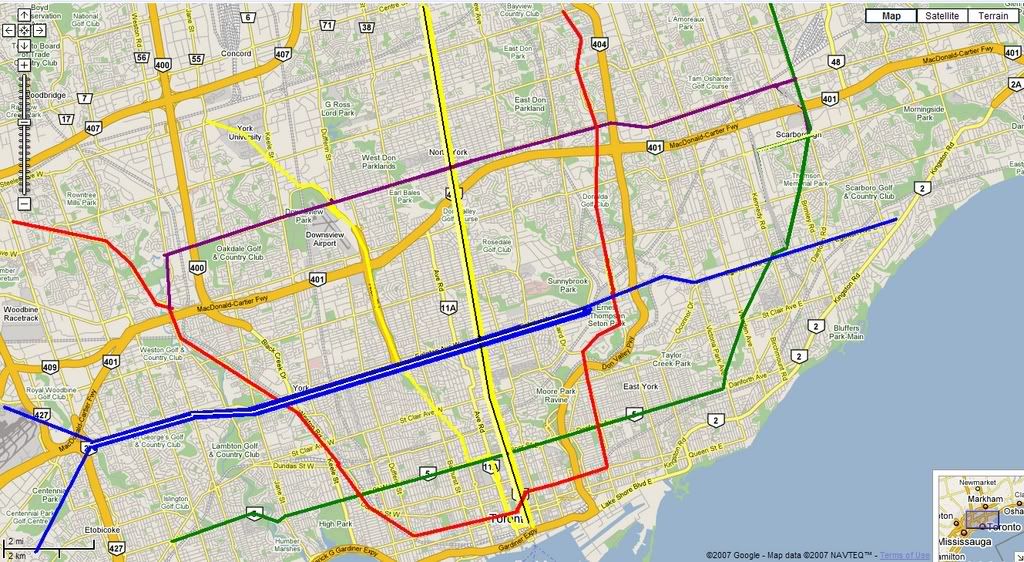
Anyways, I have one suggestion. I have many a time had to listen to people talk about the TTC's subway map and say, it's so small, back in Seoul it's blah blah blah, etc. And I say, well if we had all the commuter lines (I.E. GO) added, plus streetcar (read LRT) lines, it would not look so far off. It's important to understand that the maps for Seoul and Tokyo include LRT and Commuter lines with the same prominence as the subways. That being said, my suggestion basically is, integrate the GO lines more, and don't gray them out, I think the result will be that much more impressive.

In any case, keep up the great work! :p
 
And I say, well if we had all the commuter lines (I.E. GO) added, plus streetcar (read LRT) lines, it would not look so far off. It's important to understand that the maps for Seoul and Tokyo include LRT and Commuter lines with the same prominence as the subways.

Well, Seoul does have 10 subway lines, and Tokyo has 12. Toronto has 2.5. Hopefully, we won't rely exclusively on drawings to make our system more impressive.

Having said that, I agree that TTC subway maps should include LRT and GO, the latter perhaps only vague lines + connections. Hopefully Metrolinx (ugh) will help make that happen.
 
Under no circumstances should GO lines be as prominent as subway lines on Toronto maps so long as half the GO routes only run 4 trains per day. Streetcar lines shouldn't be there, either. The only reason to throw everything together onto one stylized map is to make it look more world class, but this does a real disservice to riders. What good is a map where the Harbord and Willcocks stations on the Spadina streetcar are the same distance apart as, say, Bradford GO to Newmarket GO? Such a map would exclude any concept of distance, time, or reliability.
 
^Not to mention it gives off the false impression we're getting the same level of service (frequency/reliability) as a subway/LRT ROW.
 

Back
Top